Our own project · Website rebuild · October 2026
Building our own website around the way we work.
Our own website needed to explain one connected offer: helping customers find your business, and going out to find customers for you. We rebuilt the site around that proposition, with clear services, published prices and evidence visitors can inspect.
Inside the work / The decisions
Our own offer, brought into focus.
We rebuilt our website around a connected offer: helping customers find a business, and going out to find customers for it. Clear services, published prices and inspectable work shaped the structure.
Make the offer clear
Each of the six services has its own route, with pricing accessible from the main navigation.
Build a recognisable system
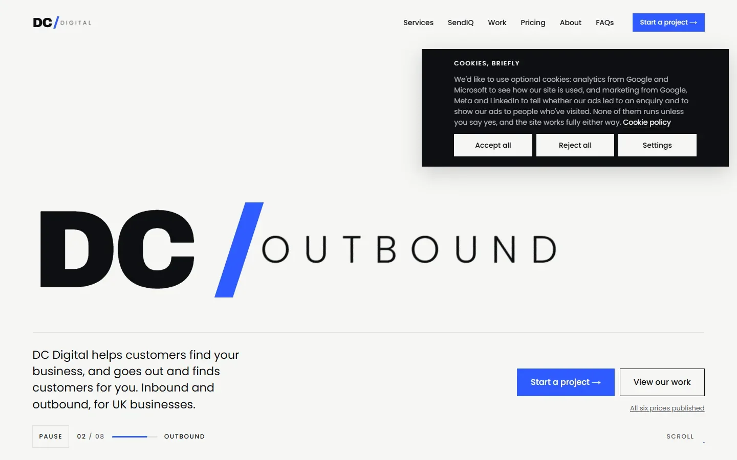
The DC slash, cobalt blue and strong type connect service, editorial and case-study pages.
Show the actual change
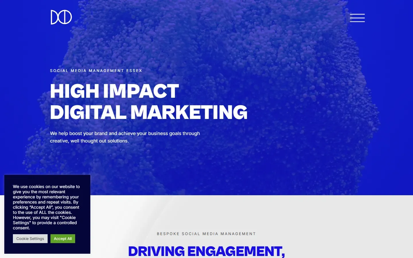
The comparison uses real captures of the previous website and the October 2026 staging build.
Our own project. The rebuild remains on staging; these images and build checks do not establish traffic, enquiry or sales results.
A brief for our own business
This is an internal DC Digital project. In October 2026, we took the site through the same documented stages used in our website work: research, page planning, a written brief, copy, design, build and checks.
The starting point was the business and the decisions a visitor needs to make. What do we do? Which service fits? What does it cost? What have we actually delivered? Those questions shaped the page structure before the individual layouts.
Make the offer easier to explore
The structure gives each of our six services its own route. SendIQ explains outbound, while website design, SEO, Google Ads, social media management and paid social explain the work that helps people find and choose a business.
Case studies sit alongside the service pages. Pricing is accessible from the main navigation. A separate Blog and Industry Insights section gives practical advice and sector analysis a clear home, rather than putting every article in one undifferentiated list.
A visual system that can grow
We built the site in WordPress with reusable page components and a shared visual system. The DC slash, cobalt blue, strong type and graphic imagery carry through the service, editorial and case-study pages.
Review changed the details. We shortened the hero spacing, restored a normal mouse pointer and added a services dropdown. On the homepage, visitors now reach the clickable service explorer before the plain-reading What we do section.
What the checks show
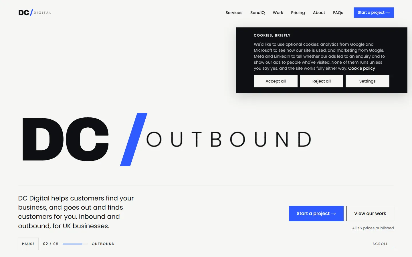
The October 2026 expansion checks covered 44 desktop and phone samples on staging. Those samples returned the expected pages, with one main heading, no horizontal overflow, no broken images and no JavaScript page errors. Automated accessibility checks in the main content reported no violations in those samples.
Those are dated build checks. They are not a claim of complete accessibility or evidence of more traffic, enquiries or sales. At the time of writing, the rebuild remains on a noindexed staging site and the main-domain launch is still to come.
The method behind the website
The useful outcome so far is a working build with an inspectable structure, documented decisions and a record of what was checked. Commercial results can only be assessed after launch, with measurement in place.
If your website no longer explains the business clearly, start with the offer and the questions your buyers ask. The visual design then has a useful job to do.